CSS is a weird language. Some people don’t even want to consider CSS as a programming language. However to me it will always be one, maybe even THE one.
Of course CSS can only be used to style your webpages, but it evolved into the one thing that defines a pleasant user experience. Without styles there would be no layout, without styles there would be no hierarchy, animations, responsiveness, interactions, etc. Of course the majority of these can be executed with javascript, but it never going to be as performant as pure CSS.
However it has its quirks… Some things in CSS just dont perform the way you’d expect them to in certain situations. I stumbled upon this article by Medium about Lesser known CSS quirks & advanced tips, and there they go into detail about some of the weirder things.
Some such weird things are:
- Vertical padding is relative to element’s width not height
- Margins overlap, but only sometimes
- Opacity can change the z-index stacking order
- Height: 100% may not do what you think it does (because parent element’s height is not set)
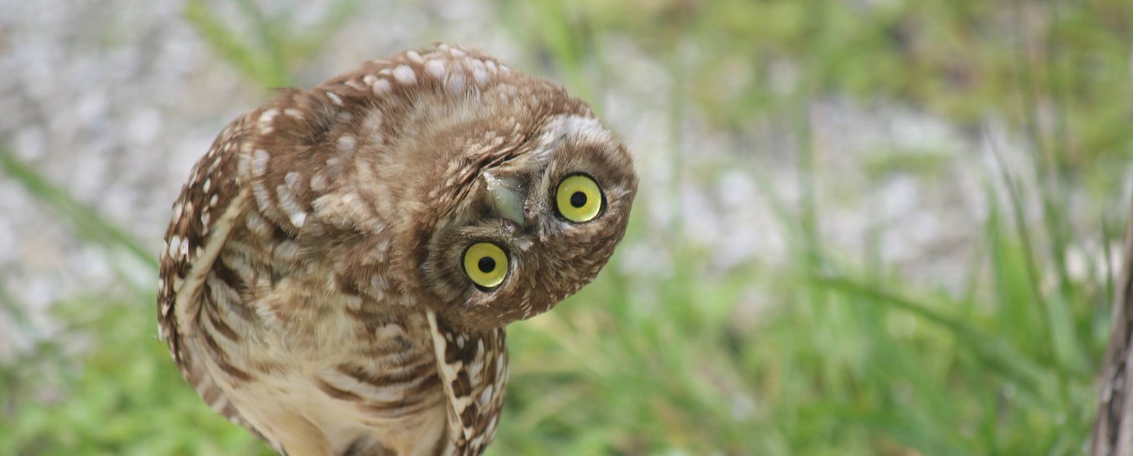
One really cool thing I found though is the concept called the lobotomised owl selector. Yes, thats right, the lobotomised owl selector.
*+*
It allows you to setup a default behaviour for all layout elements on your page, so if a new one is added it can already respect those values even before its properly styled. I quite like this idea of setting up defaults, however it is really hard to implement on large project that has been deployed.
