owls

CSS Quirks and Oddities

March 15th, 2018

CSS is a weird language. Some people don’t even want to consider CSS as a programming language. However to me it will always be one, maybe even THE one.

Of course CSS can only be used to style your webpages, but it evolved into the one thing that defines a pleasant user experience. Without styles there would be no layout, without styles there would be no hierarchy, animations, responsiveness, interactions, etc. Of course the majority of these can be executed with javascript, but it never going to be as performant as pure CSS.

However it has its quirks… Some things in CSS just dont perform the way you’d expect them to in certain situations. I stumbled upon this article by Medium about Lesser known CSS quirks & advanced tips, and there they go into detail about some of the weirder things.

Some such weird things are:

  • Vertical padding is relative to element’s width not height
  • Margins overlap, but only sometimes
  • Opacity can change the z-index stacking order
  • Height: 100% may not do what you think it does (because parent element’s height is not set)

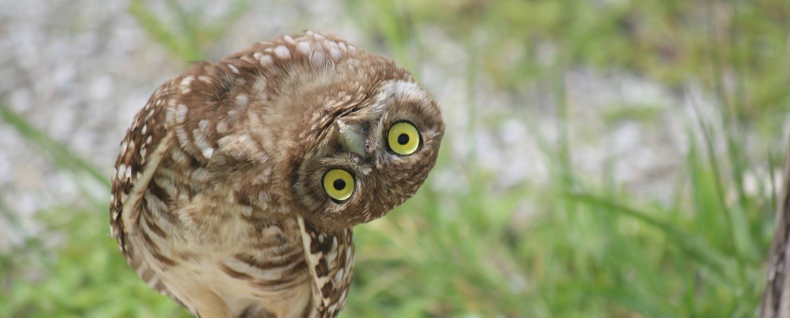
One really cool thing I found though is the concept called the lobotomised owl selector. Yes, thats right, the lobotomised owl selector.

*+*

It allows you to setup a default behaviour for all layout elements on your page, so if a new one is added it can already respect those values even before its properly styled. I quite like this idea of setting up defaults, however it is really hard to implement on large project that has been deployed.

design in 2018

Webdesign in 2018

March 15th, 2018

Design is an ever evolving industry, and web design is no exception. The practices that were revolutionary in the beginning of the 21st century, seem archaic by modern design standards. Some may say it is hard to keep up, but there are always those that want to drive progress even further.

I aspire to be one of those people, that is why I jump at every opportunity to learn something new, whether it be code or design. Since I never really studied design, I may not have the keen eye that some of my friends do when it comes to layout, or hierarchy, or just plain taste. However I can tell good design apart from the rest.

Recently I stumbled upon this article on Medium titled 7 Practical Tips for Cheating at Design. Of course I read it and pretty much agree with all the point they’ve raised:

  1. Use color and weight to create hierarchy instead of size
  2. Don’t use grey text on colored backgrounds, make the text closer to the background color is what actually helps create hierarchy
  3. Offset your shadows
  4. Use fewer borders
  5. Don’t blow up icons that are meant to be small
  6. Use accent borders to add color to a bland design
  7. Not every button needs a background color

If you notice, I highlighted #4. That is because I was shocked as to how much cleaner you can make an application by removing borders. I tried it at work and for my personal projects and the results were just great.

Here on my blog I never really had borders, so it was already decent, but I now I see why this is.

Its already 2018 and our standards keep evolving, so good design is no longer a feature, is a requirement.

flexboxes

CSS Flexboxes

February 26th, 2017

Today I would like to tell you all about this awesome property that CSS got a while back, but is now finally fully supported by all browsers and should be used by all web designers and developers. This property is called Flexbox or display: flex.

Why should you use it, you might ask. The reality of it is, if you have ever tried to centre something vertically and horizontally in CSS, you know the struggle that it is, and you know how after swearing at the screen for 30 minutes, you’d just end up cheating and setting the pixels manually, cause nothing else works. What if I told you that flexboxes allow you to centre an item within a container with 3 lines of code, and it would consistently work across all browsers? Well it can:

display: flex;
align-items: centre;
justify-content: center;

Flexboxes use the concept of a container and items within it, and uses tools like: justify and align to determine the position of the items within the container. Furthermore, you can easily flip the direction (order) of the items using flex-direction, change the direction from row to column and  grow and shrink the items with just a few lines of code. Its that simple.

I have started using flexboxes at work exclusively, and have not even had to write another "margin: 0 auto" in months! Now I am in the process of fixing up the anime club sites with the same stuff, to make them more robust and the code cleaner and more manageable.

If you want to learn more about this, then here is a link to CSS Tricks, a great website for learning about various interesting css properties and selectors.

Also there is a flexbox game, where you can learn how to align elements in various ways. Unfortunately though, they dont show you the code, but you can work it out from the buttons you are pressing on their UI.

And here is an article (with GIFs), that goes over all the flex box selectors and explains how they work.

Ringo Juice

JamieJakov Blog 4.0 – りんごジュース

February 1st, 2016

There has been a lot of stuff happening in my life recently – got a new job, moving to a new place, last semester of uni soon, started playing Hearthstone seriously, etc. So I decided it would be a great time to update my blog.

The main thing you will notice is the new theme! I call it りんごジュース (Apple Juice) because its orange and orange juice is delicious (I know that made no sense, but cool things never do). The colour scheme is once again lighter, now with more white and less orange; images are more prominent on posts, cause I really want to show off my great photos; the pages have been renamed and sections moved to more appropriate locations. This opened up potential for a new page which I call Timeline. I have yet to finish coding that page, so bare with me, as it is gonna be completely different from everything else, and thus requires much more time to put together. Also the sidebar is gone, it’s been retired in favour of a fixed top navigation bar. Decided to use a different font as well – PT Sans. (Why this one? Cause its Russian! Also, if you are wondering, Ringo is still around you just need to find her.

Read More

Two years down the road

May 30th, 2014

The cake is a lie

Wow, I can’t believe that it has already been 2 years since I set up this blog and made my first post. It has been a long ride, and I can only look back the past with sweet memories of writing up these blog posts that mostly consist of my own opinions or just random cool stuff. Like for example last year instead of celebrating a year of blogging, I was too busy being excited for Armikrog! (which still hasn’t come out)

My blog made a long way… I changed domains twice, changed to private hosting, and had 3 theme design changes. Not only did my blogs design improve with the improvement of my HTML and CSS skills, but also the content has become more interesting and more consistent. I have improved as a writer, and I am more willing to voice my own opinion.

All of this is thanks to Ruben, who inspired me to start blogging. Ruben, you will be getting a few surprises from me soon™.

Tonikaku, Happy birthday JamieJakov.me (.lv .com). Lets make a lot more good memories together!

New logo, new design, new life!

December 24th, 2013

WildFlower

I have had my blog for a year and a half now, first post being on the 20th of May 2012. In this time I have managed to change web hosts and themes. Now I believe is the perfect time to improve the design I have been using ever since I moved from wordpress.com to private web hosting – Wild Flower. Today, on the 25th of December, I would like to present my new blog theme Ring-O.

Read More