GUTS code

G.U.T.S. – The future of SMASH! ticketing.

August 1st, 2019

SMASH!, the largest anime convention in Australia, with over 22,000 people coming annually. And to support this convention we have a range of systems: website, recruitment, and ticketing. And now, in 2019, we have to rewrite the ticketing system from scratch. As a bit of backstory, let me tell you how we ended up in this situation.

The backstory of SMASH! ticketing systems

SMASH! is purely volunteer run, and because of that, it simply lacks the necessary funding to pay for expensive systems like Ticketek or Eventbrite. However SMASH! is run on passion, passion of people from all sorts of backgrounds. And who would have thought that the majority a lot of people who want to dedicate their free time to help grow such convention are IT professionals working in the field. And what do IT guys and girls like doing more than hacking systems? – that’s right, building new systems! So at some point, the IT team of SMASH! built it own ticketing system (frontend and backend), and payment link system, and pass issuing system, and local redemption system and infrastructure. One might ask why build so many systems? The answer is always simple: cause there was a need for it.

With 5 systems, maintaining them became quite the challenge, and all of 2018 was spent to just support the existing systems and add 2 minor features. However it became clear that something needed to change when the 2 tech leads, who built the ticketing system and payment link system, retired from SMASH! after 8 years of service, each.

So even before SMASH! 2018 weekend happened, Yaakov and I started taking about the future of SMASH! ticketing.

The decision

We had 4 options and we had to make a choice… Read More

Cliff side photo from drone

Photography, from a different angle

July 29th, 2019

For the longest time I have been taking photos with a DSLR camera, and sometimes with my iPhone. Recently however, I’ve been tempted by the beautiful photos from all these photobloggers and instagrammers, who capture absolutely stunning shots from angles that are near impossible, unless you have a device that can fly.

So after some consideration, I decided to spend a bit of cash and buy myself a drone – named Senkuu. I went for the DJI Mavic Air with the fly more combo (for the extra batteries), and so far its been performing absolutely amazingly. When flying it, I feel like I am a kid again, playing with a radio controlled toy, only this time its not a toy but a really amazing piece of technology that can help me capture the wonders of the world from an angle that I could not before.

I’ve taken quite a few shots with the drone and I am sure I will be taking plenty more.

You can find all the photos on my Flickr.


Sagiri

Welcome iSagiri

December 21st, 2018

iPad is a very interesting device category. It mostly fits between a laptop and a phone in terms of portability and comfort. However it gets closer to the phone in terms of productivity, but closer to the laptop in terms of screen realestate. So what gives? Why even own an iPad?

An iPad has its benefits and I believe that in a few iterations of iOS, the iPad will be able to do everything a laptop can do, and keep the benefits it has right now. That’s why I got myself a brand new iPad Pro 11″. Welcome to my iFamily – iSagiri.

Read More

iPhosphophyllite

Welcome iPhosphophyllite

October 23rd, 2018

I’ve been holding off on getting a new phone for quite some time now, but the wait is finally over. Let’s welcome the latest edition to my tech family: a brand new iPhone XS Max – iPhosphophyllite.

Why did I wait so long? And why did I finally decide to upgrade?

My previous phone was an iPhone 6S Plus, and it was an absolute powerhouse for its time. However over the past 3 years apple has greatly improved the iphones screens, their processors, their speakers, but most importantly – their cameras.

Read More

owls

CSS Quirks and Oddities

March 15th, 2018

CSS is a weird language. Some people don’t even want to consider CSS as a programming language. However to me it will always be one, maybe even THE one.

Of course CSS can only be used to style your webpages, but it evolved into the one thing that defines a pleasant user experience. Without styles there would be no layout, without styles there would be no hierarchy, animations, responsiveness, interactions, etc. Of course the majority of these can be executed with javascript, but it never going to be as performant as pure CSS.

However it has its quirks… Some things in CSS just dont perform the way you’d expect them to in certain situations. I stumbled upon this article by Medium about Lesser known CSS quirks & advanced tips, and there they go into detail about some of the weirder things.

Some such weird things are:

  • Vertical padding is relative to element’s width not height
  • Margins overlap, but only sometimes
  • Opacity can change the z-index stacking order
  • Height: 100% may not do what you think it does (because parent element’s height is not set)

One really cool thing I found though is the concept called the lobotomised owl selector. Yes, thats right, the lobotomised owl selector.

*+*

It allows you to setup a default behaviour for all layout elements on your page, so if a new one is added it can already respect those values even before its properly styled. I quite like this idea of setting up defaults, however it is really hard to implement on large project that has been deployed.

design in 2018

Webdesign in 2018

March 15th, 2018

Design is an ever evolving industry, and web design is no exception. The practices that were revolutionary in the beginning of the 21st century, seem archaic by modern design standards. Some may say it is hard to keep up, but there are always those that want to drive progress even further.

I aspire to be one of those people, that is why I jump at every opportunity to learn something new, whether it be code or design. Since I never really studied design, I may not have the keen eye that some of my friends do when it comes to layout, or hierarchy, or just plain taste. However I can tell good design apart from the rest.

Recently I stumbled upon this article on Medium titled 7 Practical Tips for Cheating at Design. Of course I read it and pretty much agree with all the point they’ve raised:

  1. Use color and weight to create hierarchy instead of size
  2. Don’t use grey text on colored backgrounds, make the text closer to the background color is what actually helps create hierarchy
  3. Offset your shadows
  4. Use fewer borders
  5. Don’t blow up icons that are meant to be small
  6. Use accent borders to add color to a bland design
  7. Not every button needs a background color

If you notice, I highlighted #4. That is because I was shocked as to how much cleaner you can make an application by removing borders. I tried it at work and for my personal projects and the results were just great.

Here on my blog I never really had borders, so it was already decent, but I now I see why this is.

Its already 2018 and our standards keep evolving, so good design is no longer a feature, is a requirement.

u.x.

Introduction to User Experience Design

June 20th, 2017

User experience (UX) design is a relatively new field and only came around with the mass adoption of computers and digital technology. It has evolved over the years and is now an essential part of the digital product development cycle. The core mission of UX is to craft digital experiences that not only empower, but also delight users. In this digital era, innovation never stops and with it more and more opportunities for creating user experiences arise.

The question is how does one get into UX design. Is knowledge of coding essential? Or a degree in design? In reality it doesn’t matter, anyone with a keen eye for detail and a passion to make things better can be a UX designer.

But what is UX? UX is both the end result experience a product offers and a set of methods with which to craft experiences. These methods include various user research techniques, crafting user-flows, layout design, and user testing.

In this article I will give a brief overview of a few concepts that will help define the needs of the users, how to work with and adapt to constraints, what it means to create a story that shapes the experience, the innovation aspect of UX and that good UX comes from a lot of testing and being open to input.

Seeing Through the Users’ Eyes

The most important aspect of UX design is to learn that the ways users interact with a product and the experiences they have with it vary wildly depending on their backgrounds and life situations. In order to create a pleasing user experience considerations of the users age, background, physical location, interests, and of course comfort level with technology, need to be considered and designed around.

Read More

flexboxes

CSS Flexboxes

February 26th, 2017

Today I would like to tell you all about this awesome property that CSS got a while back, but is now finally fully supported by all browsers and should be used by all web designers and developers. This property is called Flexbox or display: flex.

Why should you use it, you might ask. The reality of it is, if you have ever tried to centre something vertically and horizontally in CSS, you know the struggle that it is, and you know how after swearing at the screen for 30 minutes, you’d just end up cheating and setting the pixels manually, cause nothing else works. What if I told you that flexboxes allow you to centre an item within a container with 3 lines of code, and it would consistently work across all browsers? Well it can:

display: flex;
align-items: centre;
justify-content: center;

Flexboxes use the concept of a container and items within it, and uses tools like: justify and align to determine the position of the items within the container. Furthermore, you can easily flip the direction (order) of the items using flex-direction, change the direction from row to column and  grow and shrink the items with just a few lines of code. Its that simple.

I have started using flexboxes at work exclusively, and have not even had to write another "margin: 0 auto" in months! Now I am in the process of fixing up the anime club sites with the same stuff, to make them more robust and the code cleaner and more manageable.

If you want to learn more about this, then here is a link to CSS Tricks, a great website for learning about various interesting css properties and selectors.

Also there is a flexbox game, where you can learn how to align elements in various ways. Unfortunately though, they dont show you the code, but you can work it out from the buttons you are pressing on their UI.

And here is an article (with GIFs), that goes over all the flex box selectors and explains how they work.

▹ or ▿ ?

September 7th, 2016

This title may sound a bit strange, but the question behind it is very serious and has caused numerous debates between UI designers.

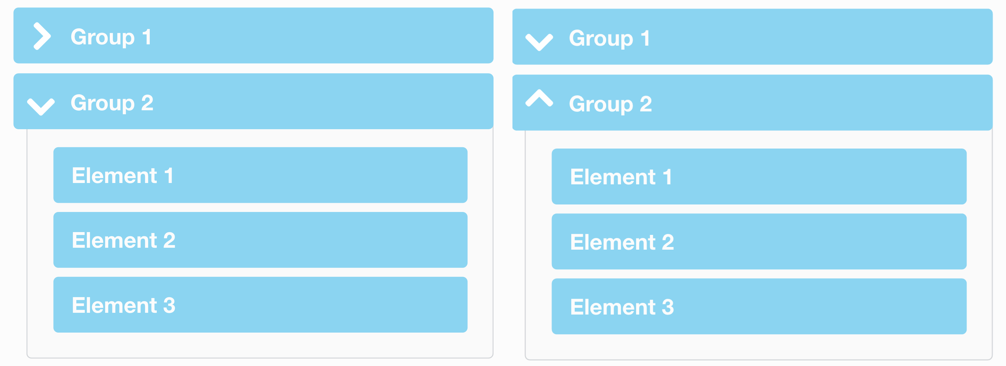
When a folder or a menu group is collapsed should the arrow point to the right, or downwards?

This is an example of the arrow point to the right when collapsed and downwards when expanded. However not everyone believes in this standard, so UI designers fight that the arrow should be down when collapsed and up when expanded. As you can see in the article image above, the 2 options are both valid, however option 1 (on the left) has dominated the technology space as Microsoft (with Windows), Apple (in macOS) and pretty much all the Linux OSs all use this notation for folders, groups of contacts, and any other kind of grouped lists.

The web however is a different beast and a lot of designers come from print, so they know how things should work in the real world, but no so much how the standards have been set in computers for the past few decades.

Read More

sass

Web, the SASSy way

July 24th, 2016

I’ve been designing and coding websites for a good 4 years now, but only as a hobby in my spare time, nothing serious or professional. It was all basically just simple HTML DOM together with a CSS file defining the look of my sites. Sometimes I would experiment with certain JS features to have menu bars and various animations, but hat was about it. Last year, when I migrated my blog hosting, I had to learn how to set up a web server from scratch using LAMP. And I did, twice: jamiejakov.lv and utsanime.net. Looking back now thats not a great achievement, especially with all the guides out there, but hey, when you don’t know anything, even something as simple as setting up a LAMP can be hard.

And now I think its time for me to learn more about web programming, about the frameworks that are used, about the nifty things that have been developed to make our lives easier and create intuitive and beautiful user experiences. And the first think I am going to learn is SASS.

What is SASS? Its pretty much CSS on steroids. It allows you to declare variables, nest code, add mixins, inheritance and much more. But why listen to me, when they got a clear guide on all the great features up on their website: SASS-Lang. I am just going through the codecadamy tutorial on SASS and am planing on implementing it in my future AnimeSydney and anime@UTS redesigns!

Also it is important to note that SASS is a pre-processor, so the browsers themselves can’t interpret anything form a .scss file. So we must compile the SASS file first, which will transform it into a browser readable .css file. Most text editors for code have plugins for SASS compilation. I, for example, use Coda by Panic.Inc for all my web development and they have a great SASS plugin available for download.

So try it out, see for yourself who much more efficient you will be at coding when you can use variables and inheritance. Happy Coding!