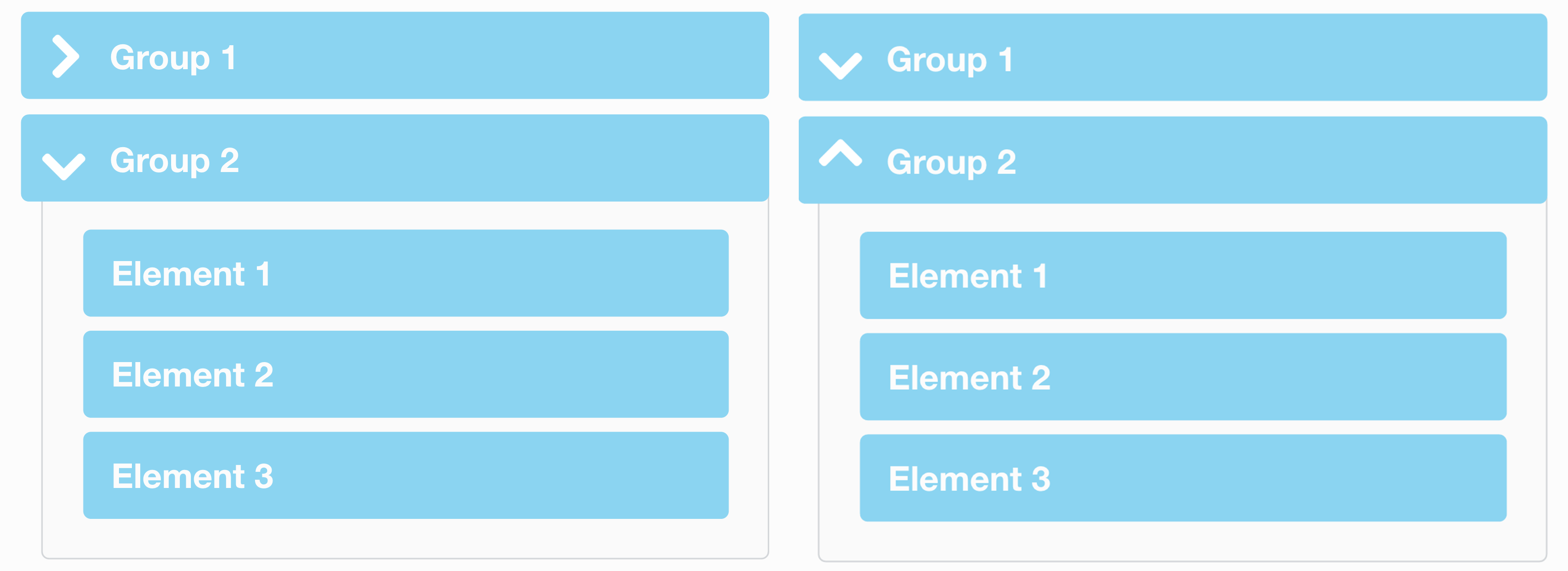
This title may sound a bit strange, but the question behind it is very serious and has caused numerous debates between UI designers.
When a folder or a menu group is collapsed should the arrow point to the right, or downwards?
This is an example of the arrow point to the right when collapsed and downwards when expanded. However not everyone believes in this standard, so UI designers fight that the arrow should be down when collapsed and up when expanded. As you can see in the article image above, the 2 options are both valid, however option 1 (on the left) has dominated the technology space as Microsoft (with Windows), Apple (in macOS) and pretty much all the Linux OSs all use this notation for folders, groups of contacts, and any other kind of grouped lists.
The web however is a different beast and a lot of designers come from print, so they know how things should work in the real world, but no so much how the standards have been set in computers for the past few decades.
What is the logic?
Well in option 1 (on the left) the arrow indicated the current state. Currently the group is collapsed, so the only thing there is to see is the text on the right, so please read that – this is what the arrow indicates. When expanded, the arrow says: please look bellow me as there is a big list of things that I expanded for you.
Option two, on the other hand, represents an action; what will happen when I press this. Thus it will drop down when I am closed, and it will collapse when I open.
I firmly believe that option 1 is the proper way that makes more sense and is an established standard, so interacting with it will be more intuitive to the users. So all I can say is that when creating expandable list groups, I highly recommend doing research on why this standard has been so widely used and what are its benefits over the down-up approach of actions.
